


Prologue
CSS offers two contemporary layout models, Flexbox and Grid, which enable developers to design intricate and adaptive web layouts without resorting to obsolete techniques like tables. These models are highly flexible and robust, providing a comprehensive solution for designing modern web layouts.
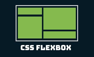
Exploring CSS Flexbox: Terminology and Properties
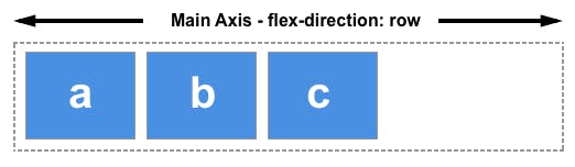
Flexbox is a contemporary CSS layout model that simplifies the creation of flexible and adaptive web designs. It operates in a single dimension, either horizontally or vertically, making it ideal for handling layout and alignment of elements within a container with ease and efficiency.
Terminology
Before we get into the details of how Flexbox works, let's start by understanding some of the key terminology that you'll come across when working with it:
Flex container: The parent element that contains one or more flex items.
Flex items: The child elements within the flex container that are arranged according to the Flexbox layout.
Main axis: The primary axis along which the Flex items are laid out. This can either be horizontal (left-to-right) or vertical (top-to-bottom).

Cross axis: The secondary axis perpendicular to the main axis. This can either be horizontal (top-to-bottom) or vertical (left-to-right).


Flex direction: The direction of the main axis. It can be set to row (horizontal) or column (vertical).
Flex wrap: Determines whether the Flex items should wrap onto multiple lines if there are too many to fit in a single row or column.
Flex flow: Shorthand that combines both flex direction and flex wrap properties.
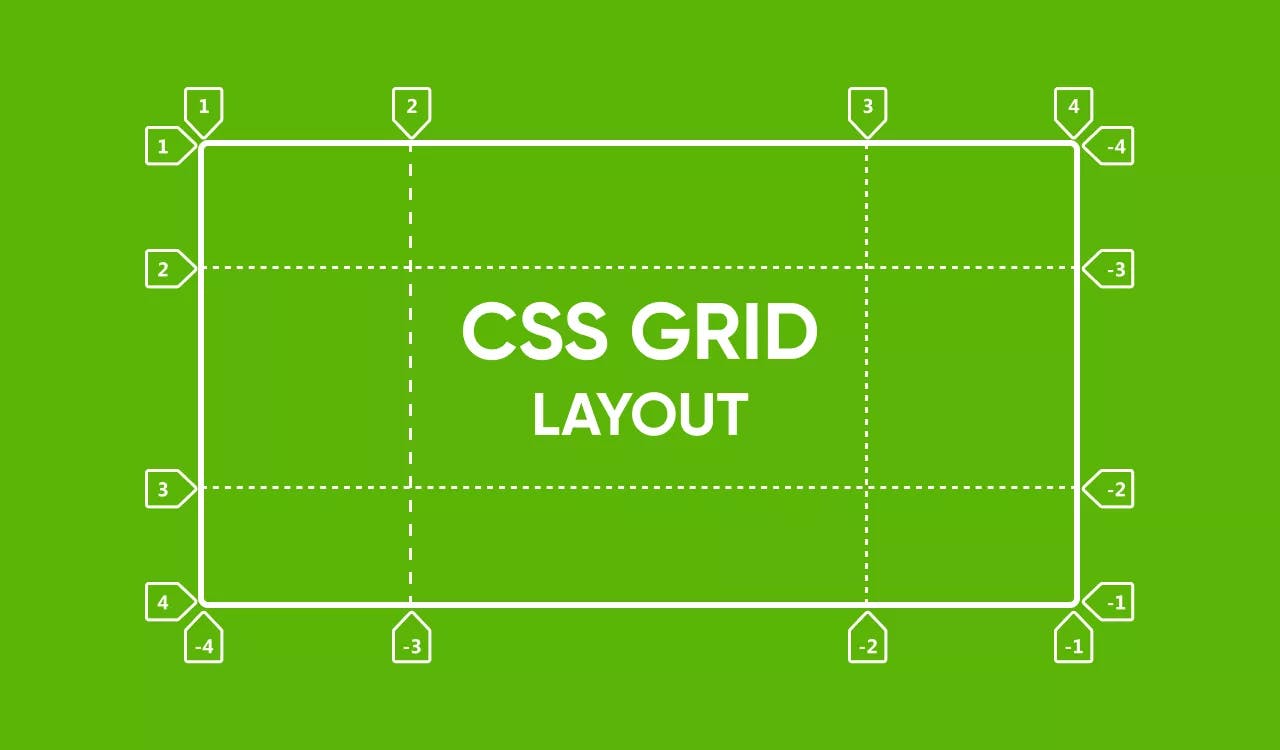
Main start and end: The two ends of the main axis, often referred to as
startandendorleftandrightif it's a horizontal layout).
Cross start and end: The two ends of the cross axis, often referred to as
startandendortopandbottomif it's a horizontal layout).Flex basis: The initial size of a flex item before any additional space is distributed within the flex container.
Flex grow: Determines how much the flex item should expand to fill any available space within the flex container.
Flex shrink: Determines how much the flex item should shrink if there's not enough space available within the flex container.
Flexbox Properties
Flexbox provides a number of properties that allow controlling the layout of Flexbox containers and items.
Properties for the Container
display: Defines the container element as a Flexbox container. This is set toflex.flex-direction: Specifies the direction in which the Flex items flow. This can either berow, for a horizontal direction, orcolumn, for a vertical direction.justify-content: Aligns and distributes the Flex items along the main axis. This can be set toflex-start,flex-end,center,space-betweenorspace-around.align-items: Defines how the Flex items align themselves perpendicular to the main axis. This can be set tostretch,flex-start,flex-end,centerorbaseline.flex-wrap: Defines the wrapping behavior of the Flex items when there isn’t enough space available in the main axis. This can be set tonowrap,wraporwrap-reverse.align-content: Defines the distribution of the Flex items when there is extra space on the cross axis. This can be set toflex-start,flex-end,center,space-between,space-aroundorstretch.
Properties for the Items
flex-basis: Sets the initial size of a Flex item before any growth or shrinking occurs. Defaults toauto.flex-grow: Determines how much a Flex item should grow to fill up any available space in the main axis.flex-shrink: Determines how much a Flex item should shrink if it cannot fit within the available space in the main axis.flex: Shorthand for specifyingflex-grow,flex-shrinkandflex-basisproperties of a Flex item. The default value is0 1 auto.align-self: Overrides thealign-itemssetting for a specific Flex item. Can be set toauto,flex-start,flex-end,center,baseline´ orstretch`.
Flexbox is a modern and powerful layout tool that provides designers with a flexible and efficient way of creating complex and responsive layouts on the web. Remember that it is best used for one-dimensional layout needs that can be achieved by working with either the horizontal or vertical axis.
Exploring CSS Grid: Terminology and Properties
CSS Grid is a recently developed layout mechanism embedded in CSS that facilitates the creation of versatile and robust two-dimensional grid-based layouts for designing basic as well as intricate web pages. It is a remarkably potent and adaptable layout instrument that enables us to easily fashion responsive and interactive designs.
Terminology
Let's first define some key terminology that we will use when talking about CSS Grid:
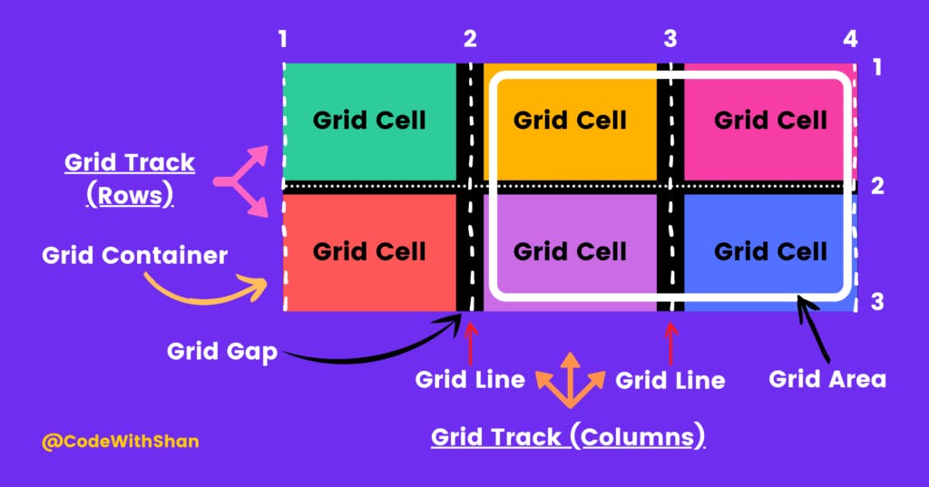
Grid container: The parent element that contains one or more grid items.
Grid item: The child elements within the grid container that are organized into rows or columns.
Grid lines: The horizontal and vertical lines that mark the boundaries of each row and column.
Grid tracks: The rows or columns themselves, defined by the space between any two adjacent grid lines.
Grid area: The rectangular space between four grid lines that contains one or more grid items.
CSS Grid Properties
CSS Grid provides us with a number of properties that allow us to control the layout of grid containers and items.
Properties for the Container
display: Defines the container element as a grid container. This is set togrid.grid-template-columnsandgrid-template-rows: Defines the columns and rows of the grid by defining the size, number, and order of the grid tracks.grid-template-areas: Defines a grid template by giving a name to a grid area described by a grid item.grid-template: Shorthand for defining bothgrid-template-columns,grid-template-rows, andgrid-template-areasin a single property.grid-column-gapandgrid-row-gap: Sets the size of the gap between columns and rows.grid-gap: Shorthand that combines bothgrid-column-gapandgrid-row-gapproperties.justify-itemsandalign-items: Specifies how the grid items are positioned within their respective grid areas.justify-contentandalign-content: Specifies how the grid areas themselves are positioned within the grid container.
Properties for the Items
grid-column-start,grid-column-end,grid-row-start, andgrid-row-end: Specifies the starting and ending positions of grid items within the grid container.grid-columnandgrid-row: Shorthand for defining a grid item’s placement in both the column and row directions.grid-area: Specifies the grid area that a grid item should span across.justify-selfandalign-self: Allows you to individually position grid items within their respective grid areas.
CSS Grid is a powerful and flexible layout system that allows us to create complex and responsive grid-based layouts with ease. This system is highly customizable and allows designers to have complete control over the positioning and sizing of grid items and their associated grid areas. With the ability to define both rows and columns of the grid, it can be used for both one- and two-dimensional layouts. It is an incredibly versatile tool and has revolutionized the way we think about and design web layouts with CSS.
Wrap-Up
It's difficult to say which layout system is objectively "better," as both CSS Flexbox and CSS Grid have their own unique strengths and use cases. The choice of which system to use ultimately depends on the specific needs of the project at hand. For simpler layouts that require arranging elements in a single row or column, Flexbox may be the better choice, as it provides an intuitive and easy-to-use system for controlling the position, size, and spacing of elements within a single dimension. On the other hand, for more complex layouts that require a higher degree of flexibility and control over both horizontal and vertical dimensions, CSS Grid may be the better choice. In either case, it's important to have a solid understanding of both layout systems and to choose the one that best fits the specific requirements of the project.
Hope you had a good reading experience.
Feedback in the comment section would be immensely appreciated.
Connect with me on my socials:
Twitter: https://twitter.com/utkarshktweets
LinkedIn: https://www.linkedin.com/in/utkarsh-krishna-3bab41240
GitHub: https://github.com/utkarshkrishna2004
Alright folks, that's all from my side.
This is Utkarsh Krishna
Signing-Off
Cheers.